A particular animation that grabbed my attention was the new commercial by Honda, for their new car the Crosstour. The commercial is a 30 second animation that follows the car and the owners through their exciting lives that the car provides for them. The car itself is a real image imposed in an animated background. The 3-dimensial commercial takes us through different origins of space as we follow a snowflake through the mountain side with the car then cuts to a snowboarder carving down the mountain. The Characters have a somewhat lifelike look to them but are more mechanistic with their bodies having a jagged edge look to them, which was done purposely by the creators. None of the objects have any smooth features to them and are mostly composed of squares and triangles, such as the trees, logs, snowflakes, and the characters bodies. Taking place in the winter, the colors in the commercial are mostly dark and cold containing a lot of dark blue and black. With some instances of warm colors such as red for the fire and the wood.
Tuesday, May 11, 2010
Animation
Tuesday, April 13, 2010

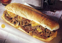
Our goal for this film was to have a narrative structure to take you inside the mind of a man who must make a decision between the love of his life (cheese steaks) or his girlfriend. We wanted to make it a comedy, simply on the fact that the idea itself is a little quirky. Knowing that we only had one class period to shoot, we thought this would be the best concept. We didn’t have to deal with location changes. We kept our shots quite simple, consisting of POV shots and medium close ups. All of the audio was put in during postproduction, the narrative section and even the conversation between the couple. Since the microphones were so bad and it didn’t pick up the conversation very well, we rerecorded the conversation through garage band, and then we added in city noise to make it sound less studio quality. I think the technical choices helped out the video greatly since no one seemed to notice the difference in the audio of the conversation.
The postproduction became a bit of a challenge for us. Once we began editing we didn’t think we had enough footage to make the video three minutes. The narrative segment of the film is only about a minute and a half so we had to bring in more footage to set up a story structure instead of jumping straight into the narrative jokes. Overall we received good feedback from our peers, they seemed to have enjoyed it and laughed at a number of the jokes. I think the video would have come out slightly better if we were able to use a tripod for some of our shots but other than that for the amount of time we had, it was a successful shoot!
Tuesday, March 2, 2010
Blog 2- editing analysis

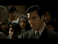
In the movie the godfather by Francis ford Coppola, the baptism/murder scene is a famous scene which involves the concept of parallel editing. The Scene consists of shots that cut between Michael Corleone at his nephew’s baptism, and his men murdering the rival mafia families. The shots are short creating a montage affect. The use of parallel editing between the church and the streets brilliantly displays the concept of holy and unholy events taking place in Michael’s life simultaneously. The order of the shots are extremely important to the overall meaning, with the priest reading from the bible and asking Michael questions about faith as the camera cuts back and forth watching his men prepare for the murder. The scene reaches its climax as Michael renounces satin and we quickly cut to the first murder taking place. During these montages, peaceful religious music plays through the church organs while we witness the murders taking places. This diagetic sound coming from the organs also helps the audience to know that these scenes are taking place at the same time. Juxtaposing the music with the murders seems to highlight Michael's conscious between good and evil. As the murders continue, the camera cuts back and forth showing the priest cleansing the baby’s face, “riding his sins”, while showing the bloody faces of the murders, once again highlighting the complexity of Michaels character and his involvement of the two different families. After the climax of the scene the camera continues to cut back and forth as we witness the family leaving the church and Michaels men leaving the murder scenes. The editing of this scene became famous for depicting the roles of good and evil in Michael Corleone’s life.
http://www.youtube.com/watch?v=O789amyaMvw&feature=related
Monday, February 8, 2010
Blog #1 modern media
The relationship that I have with media today has significantly changed and reshaped the way that I live and interact with people and events throughout the world. One primary example is the fact that I am writing this blog for a class assignment. The concept of learning online blogging or journalism and being taught new ways to interact with people digitally has created a whole new relationship in how I can connect with people and share my views and opinions and creativity with people all over the world.
The most popular kind of media that I use and create regularly is viral videos. Youtube is a website that I find myself visiting multiple times a day. I find it extremely interesting and catch myself wondering aimlessly throughout the world of youtube watching funny and pointless videos that are from all around the world and can be viewed from my laptop and even my phone now.
The idea of newspapers is almost obsolete now, with internet websites like New York Times and CNN and Yahoo news constantly being updated throughout the day, people don’t have to wait all day and read the news the next morning, we can hear and watch the news as it happens. The news is even done more and more through viral videos and less of Articles. News websites have even become user friendly and allow interaction and feedback, instead of just watching the news now we can leave feedback and comments and people can express there opinions right on the website about different events.
Thursday, December 17, 2009
Blog #4 class Evaluation
This past semester taught me a lot about the basic fundamentals of film and media. Learning skills that range from production work that goes into film making, and the different techniques that can be used to portray different meanings in films, to the media side of learning about advertising techniques such as websites and print work, and how much work that can be as well.
I thought the Lecture classes were the downside of the class however. There were a few lecture classes where we spent the entire class learning about a subject then finding out was wasn't relevant to the tests, Such as the binary lecture. It seemed as if we spent a lot of time on learning un-important information and not enough time on the important.
Learning about HTML was a really interesting section of the Lab. I particularly enjoyed those couple of classes where we worked on Text wrangler. It really showed how much work goes into creating a website and how complicated it can be. Dealing with all the codes and link systems it can be very tedious work and the simplest mistakes really instantly change the outcome of the website. One subject I wish we would have spent more time on was learning about the film camera and the different parts on how they work. We only got a few minutes in one class to really take a look at it. And one subject which i was surprised we didn't learn about- since the class was about new media today- was the techniques of working with professional digital cameras and all the different parts and settings that involve those cameras.
Overall the class really sparked my interest on what is to come next semester. It should binteresting to see how much hands on work we will get.
Wednesday, December 2, 2009
Design i like
 From your first look, its obvious to see that