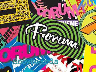
 From your first look, its obvious to see that
this design by Forum snowboards breaks pretty much all of the rules involved with advertising concepts. This collage has absolutely no balance in it whatsoever, it uses at least 10 different fonts, and has pretty much every color possible along with numerous different patterns all mashed together. And yet all of these concepts seem to be the reason why it I have it as my Wallpaper and cant stop staring at it everyday.
With so much going on within the picture, i think this forces the viewer to observe the image even more. Instead of one quick glance and simply seeing there product, you have to continue to stare at it because your always finding new images and colors and designs within the same picture. And in the advertising business, the longer you can get someone to look at your product, the more likely there going to use it. The extremely bright neon colors along with the hypnotizing design tells a little bit about the company and the team itself. The image seems to look like a party on its own, which can pretty much describe the mentality of the forum team since it consists of pot smoking, party going, rebellious snowboarders. This also resembles Forum's style of snowboarding clothes as well, with jackets, snowboards, and pants consisting of bright colors and mixed matched patterns, its definitely a company that attracts a younger more outgoing crowd.
No comments:
Post a Comment